
Reaching the whole market is not a translation job you tack on at the end. It is a design decision you make at the start. Here is what that means, why it matters commercially, and how to do it without doubling your costs.
Why English-only quietly caps your reach
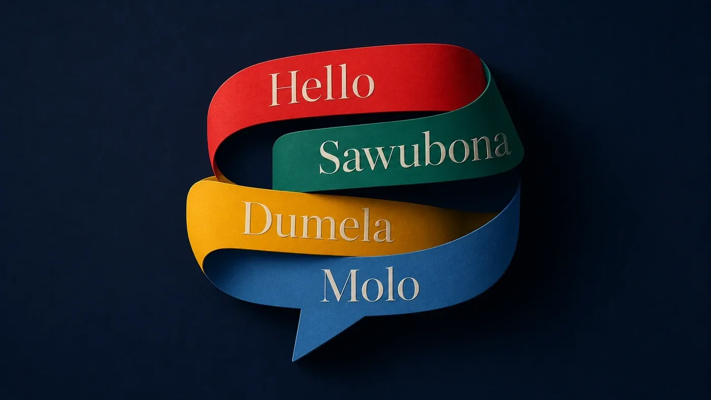
English is a common business language in South Africa, so building a brand in it feels safe and complete. It is also, for millions of customers, not the language they think, feel or buy in. People trust what speaks to them in their own words. A message that lands perfectly in English can feel distant, official or simply not-for-me to a customer whose first language is isiXhosa, isiZulu, Afrikaans or Sesotho.
For a small local shop, English-only may be fine. For a brand with national ambition, a government or public-sector audience, an NGO serving communities, or any company trying to grow beyond a single segment, it is a hard limit on reach disguised as a finished brand.
Translation is not localisation
The most common mistake is treating other languages as a translation task handed to whoever is cheapest, at the end, once the "real" design is done.
Translation swaps words. Localisation makes a message feel native. Tone, idiom, humour, formality and cultural reference all shift between audiences, and a literal translation often lands as awkward, cold or unintentionally funny. A tagline that is warm and clever in English can become stiff and meaningless when run word for word through another language. Done well, localisation rewrites the intent so each audience feels the brand was made for them, because it was.
Design that breaks when the words change
Here is the part designers forget until it bites them. Text is not the same length in every language. A headline that fits beautifully in English can run thirty percent longer in another language and break your layout, push buttons off screen, or force ugly line breaks across a carefully balanced design.
If a brand and website are designed around English text and the other languages are poured in later, things crack. Buttons overflow. Headlines wrap badly. Carefully tuned spacing falls apart. The fix is to design for flexible text from the very first layout, so the system flexes to hold any language rather than breaking when a longer one arrives. That is a decision you can only make properly at the start.
Websites and documents that switch without falling apart
A truly multilingual brand needs more than translated words. It needs systems. A website where a visitor can switch language and every page holds its shape. Brand templates that work across languages without a designer rebuilding each one. Documents, forms and campaigns that can be produced in several languages from one well-built source rather than designed from scratch each time.
This is where good structure pays for itself. Build the system once to handle multiple languages, and producing each new version becomes fast and cheap. Skip the system, and every language becomes its own expensive, error-prone project.
Doing it without ballooning the cost
The fear is that multilingual means multiplying every cost by the number of languages. Done badly, it does. Done well, it does not.
The trick is to build for it from the start. A flexible design system, templates that adapt, and smart production tools mean that adding a language is largely a matter of feeding in well-localised content, not redesigning everything. Techniques like variable data and data merge let you generate many versions of a document or campaign from a single master, so reaching more audiences costs a fraction of building each one by hand. The up-front investment in a good system is what keeps the ongoing cost sane.
Why this is Cape Town's quiet advantage
Cape Town brands sit in one of the most linguistically and culturally diverse markets in the world, and the ones that genuinely speak to that diversity stand apart. Most competitors design in English and bolt on the rest as an afterthought, if at all. A brand built from the start to speak to all of South Africa does not just reach more people. It signals respect, belonging and seriousness in a way an English-only competitor cannot fake.
This is the work we love. We build brands, websites and document systems designed to carry more than one language with confidence, so your reach matches your ambition.
Frequently asked questions
What is the difference between translation and localisation? Translation converts words from one language to another. Localisation adapts tone, idiom and cultural reference so the message feels native to each audience. Localisation is what actually builds trust.
Does a multilingual brand cost a lot more? Not if it is built for it from the start. A flexible design system and smart production tools mean adding a language is mostly content work, not a full redesign each time.
How many languages should my South African brand support? It depends on your audience and ambition. The point is to design a system that can carry more than one language well, then choose the languages your real customers use.
Build a brand that speaks to all of South Africa
Reaching more than one audience? Let us design a brand and website that speak to all of them, properly, from the start, without the cost spiralling.
Explore Localisation, Language Services, Website Design and Identity Development, or talk to Sorted Design International in Cape Town.