All work
Triple Two.
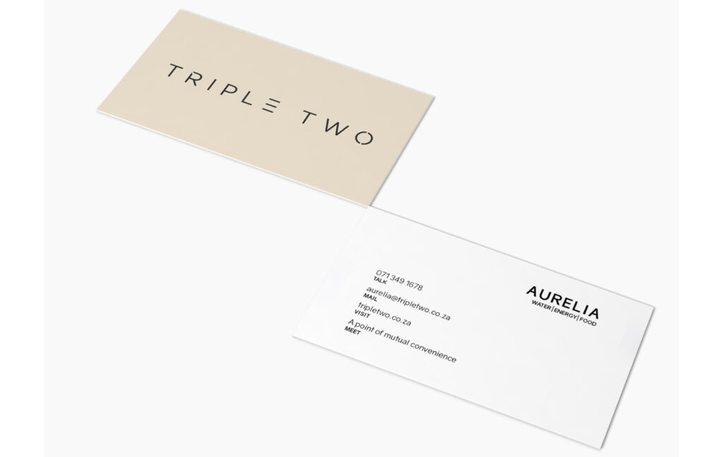
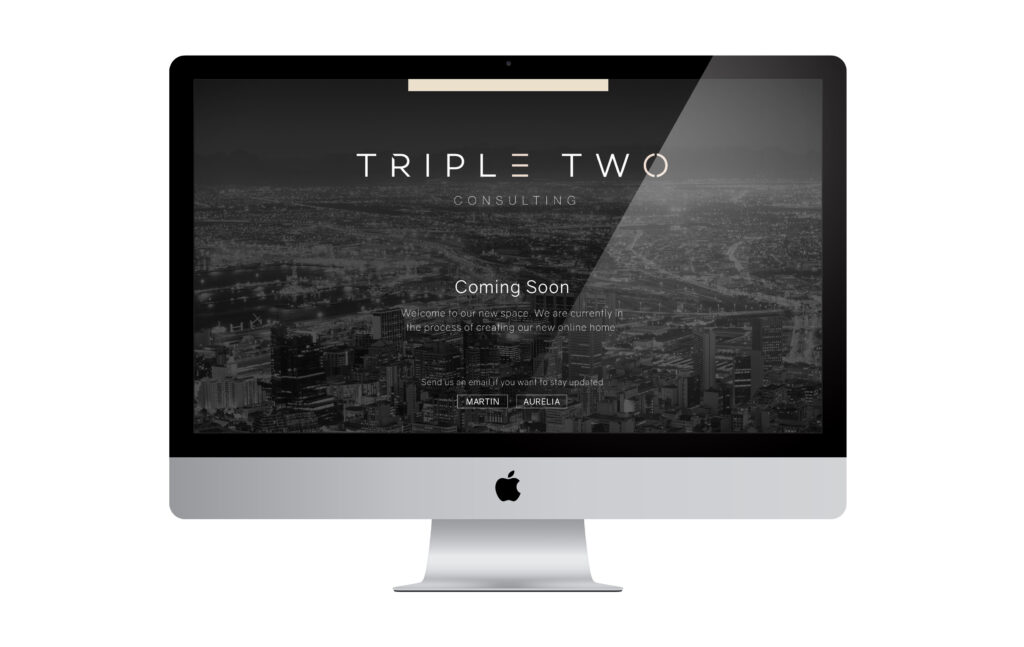
A modern identity created for a Cape Town based consultancy working across water, energy and food systems.

DisciplineIdentity Design
ClientTriple Two
LocationCape Town
The brief.
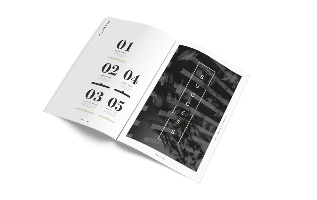
The name ‘Triple Two’ was translated into a minimal typographic logo using three horizontal bars and a broken circle as graphic symbols for repetition, flow and openness. The visual system extends into print, business cards, stationery and digital assets with a strong sense of reduction, confidence and understated elegance.
The identity aims to convey integrity and clarity, with a hint of edge that reflects the firm’s strategic focus on complex sustainability issues.
Want to be next?
hello@sorteddesign.co.za
Tell us what you are making, the audience you want to reach, or the problem you would like to hand over.