
OHHA.
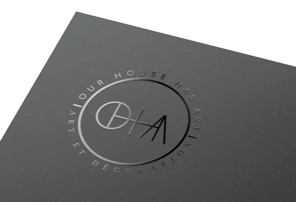
OHHA (Our House Has Art) is not just a gallery but a curated home for contemporary work. The identity had to feel rooted in art history yet boldly present, a single mark that reads as monogram, signature and emblem at once.
The brief.
OHHA is not just a gallery. It is a curated experience, a holding space for contemporary expression, fine objects and curated editions. The identity needed to reflect this duality, rooted in art history yet boldly present. Sorted Design International created a typographic identity built on balance, reduction and symbol. The final mark is both a monogram and a concept. A circle bisected to form the letter O, joined seamlessly to H, H and A, a structure that visually holds space while reading as a name, a signature and an emblem.
The brand system extends across packaging, printed matter, digital interfaces and gallery signage. A mix of serif and geometric sans typefaces supports the visual tone, referencing classic galleries and modern publishing. The palette is timeless, black and white, with hints of gold for special editions. Every detail is intentional, from embossed seals to the subtle curve of the printed circle. The result is a quietly iconic identity, flexible across contexts yet unmistakably its own, poised for use in print, merchandise, catalogues, and gallery communications across continents.
The mark is a space.
A vessel.
A house for holding art.


Want to be next?
Tell us what you are making, the audience you want to reach, or the problem you would like to hand over.