
Havenluxe.
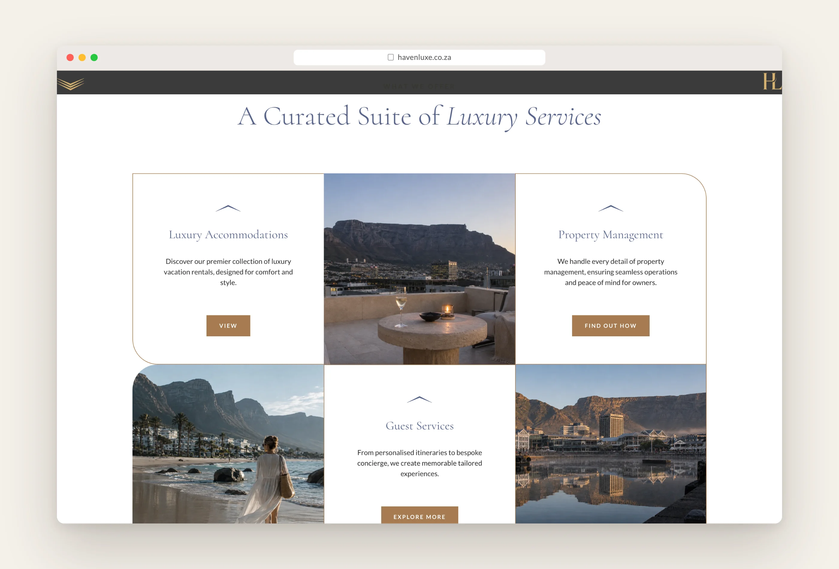
Havenluxe manages a curated portfolio of luxury holiday homes in Cape Town for local and international owners, with a concierge service for the guests who stay in them.
Die opdrag.
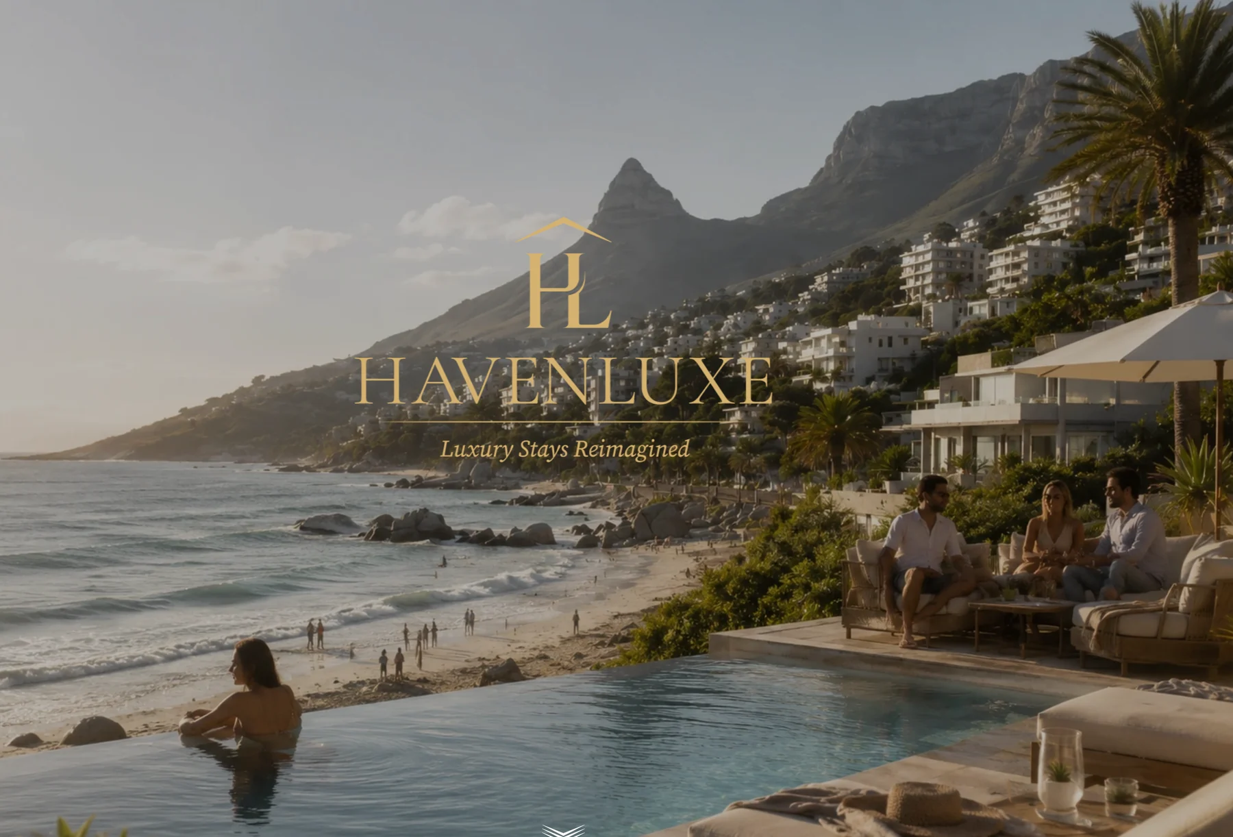
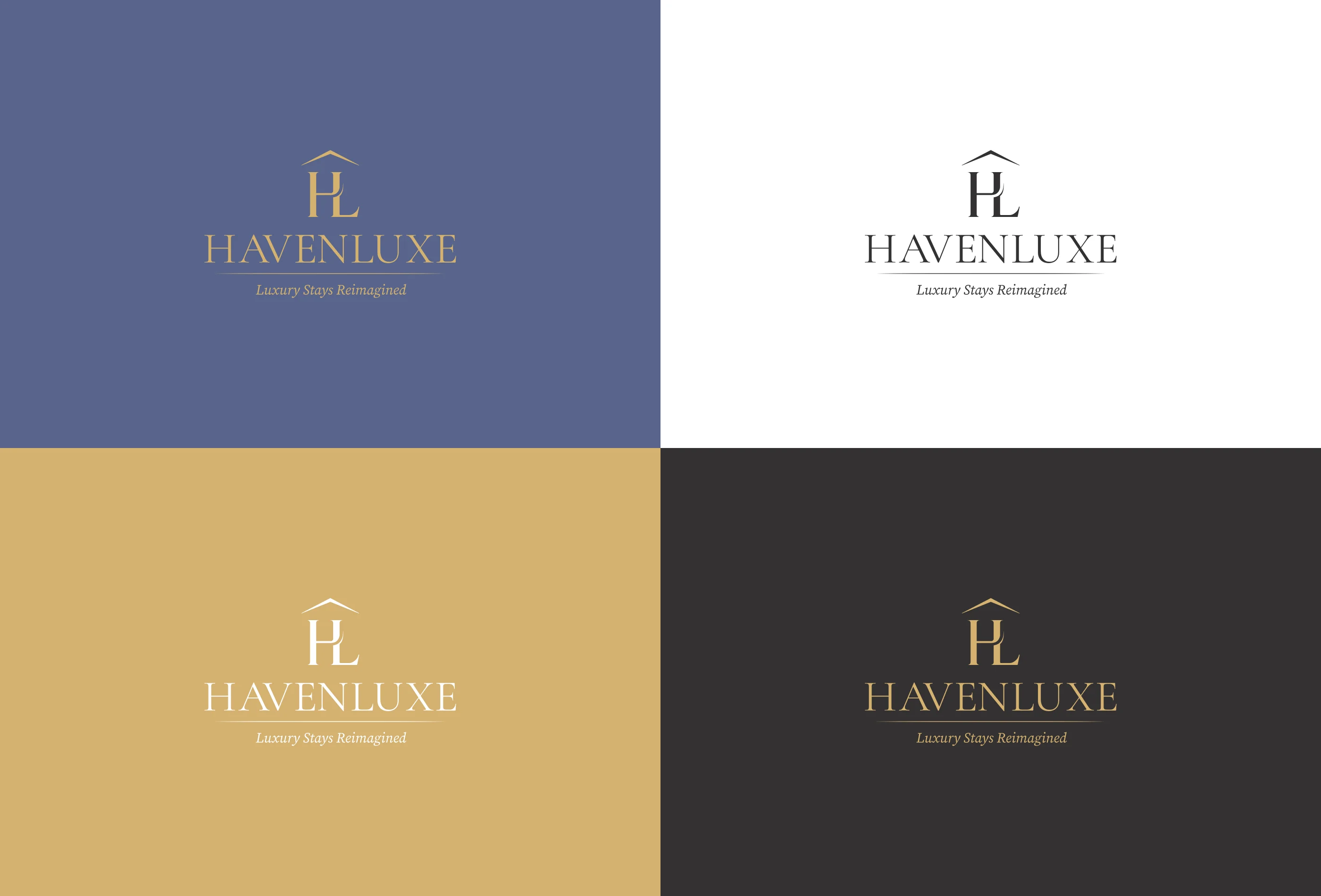
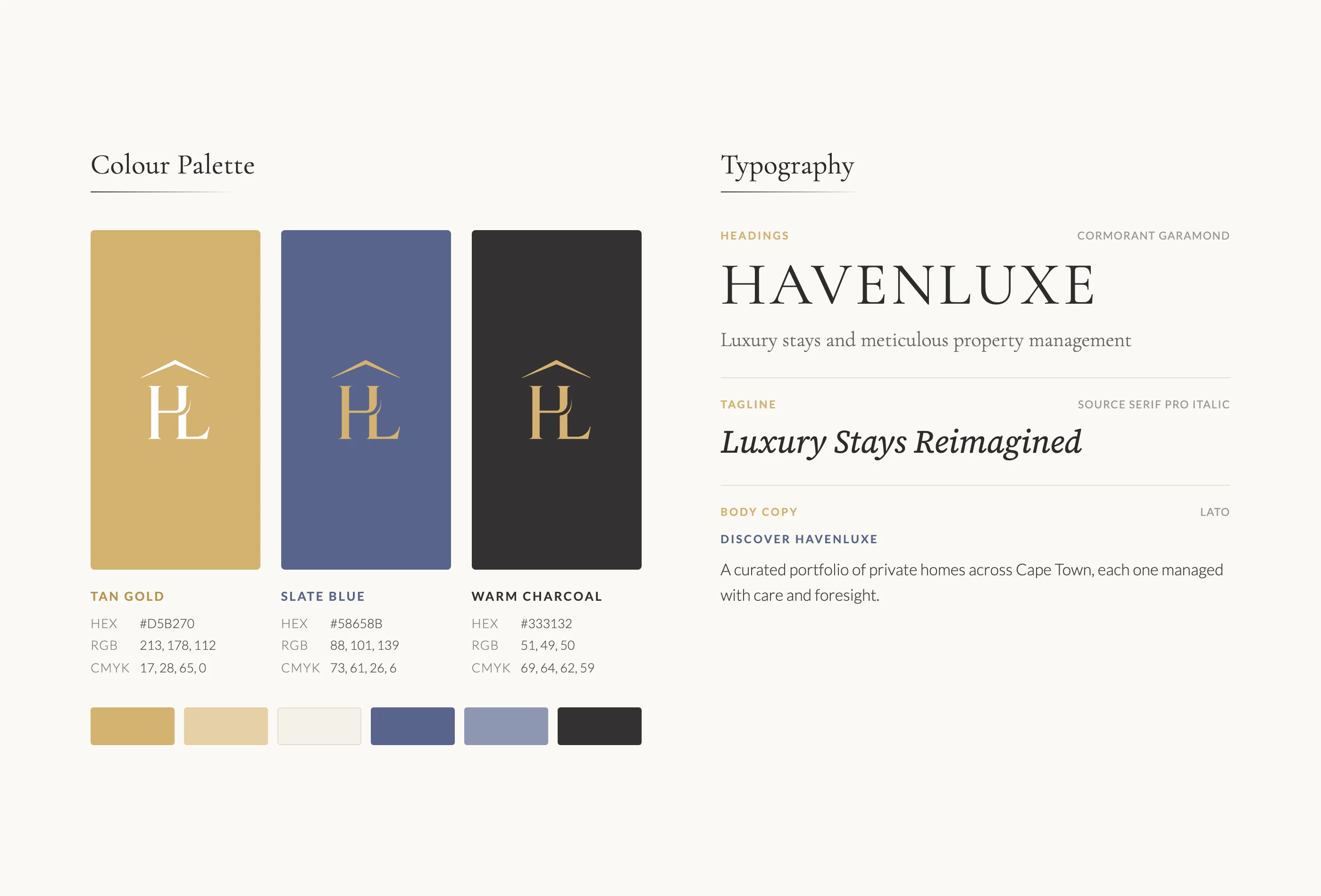
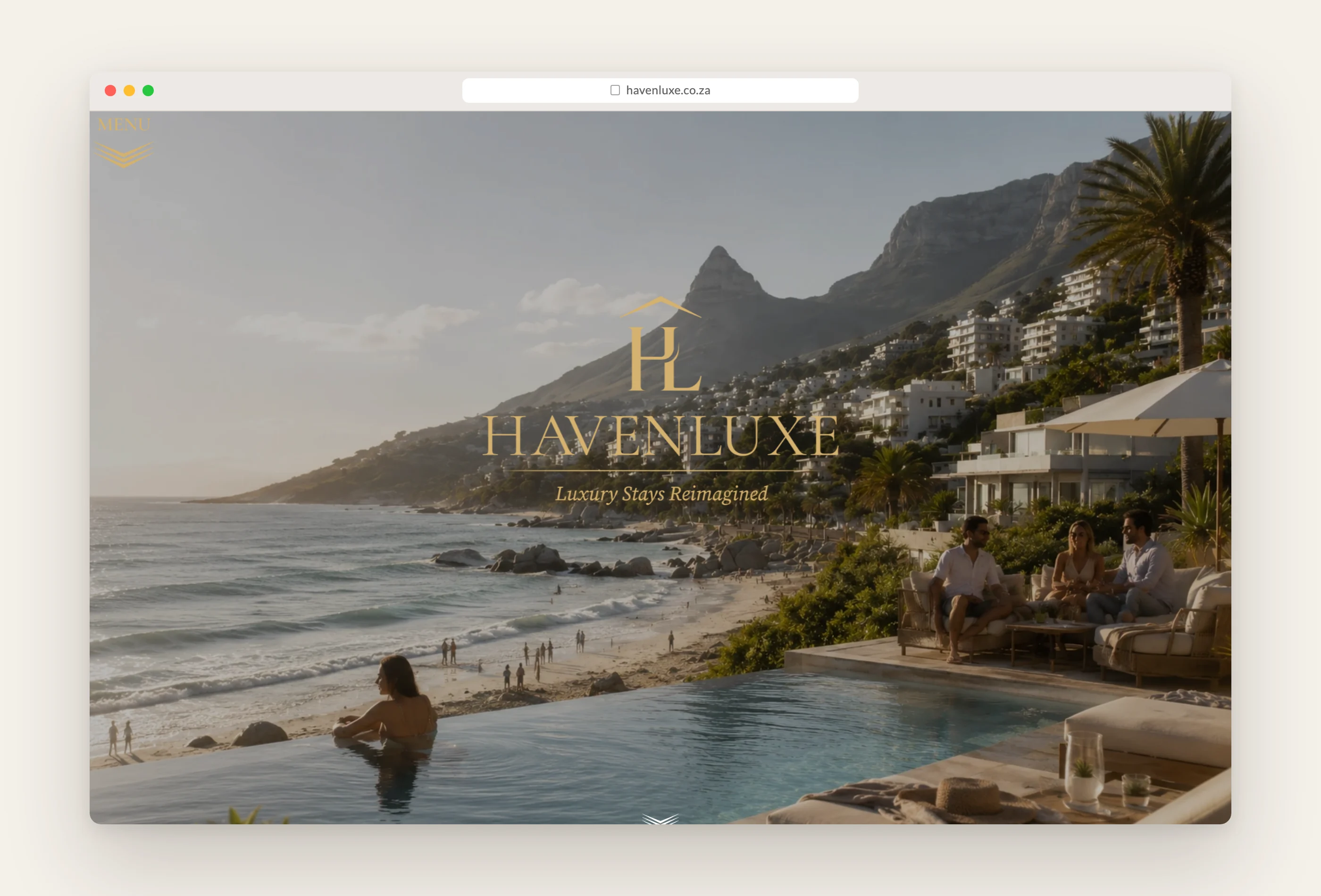
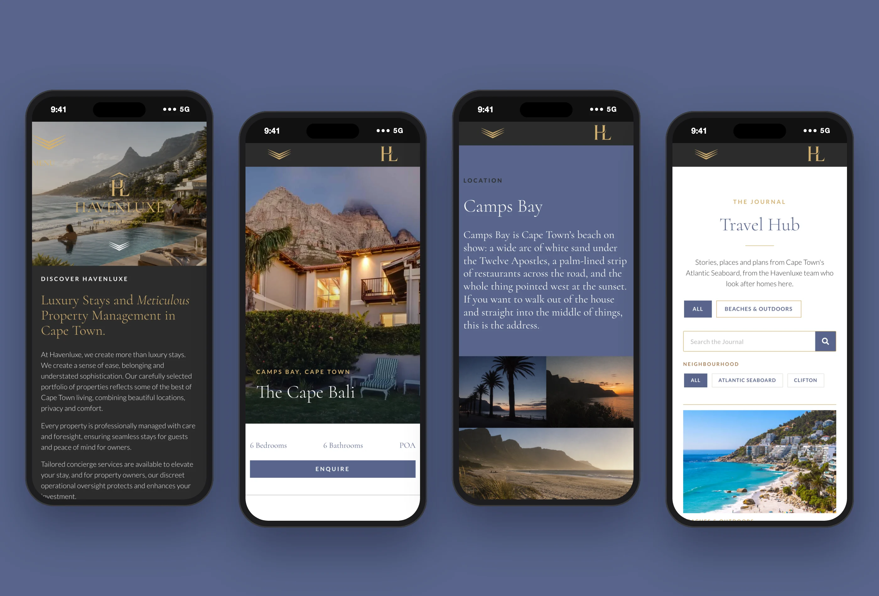
Havenluxe came to us with a logo that was nearly there: an HL monogram under a roofline, set in a classic serif with a gold foil finish. We refined it rather than replacing it. The monogram and roofline stayed, the drawing was tightened, the wordmark was reset in a lighter Cormorant Garamond with Luxury Stays Reimagined beneath it, and the foil effect became a flat Tan Gold that holds up on a screen, a sign and a business card. Tan Gold, Slate Blue and Warm Charcoal, with Cormorant Garamond and Lato, now carry the brand everywhere else.
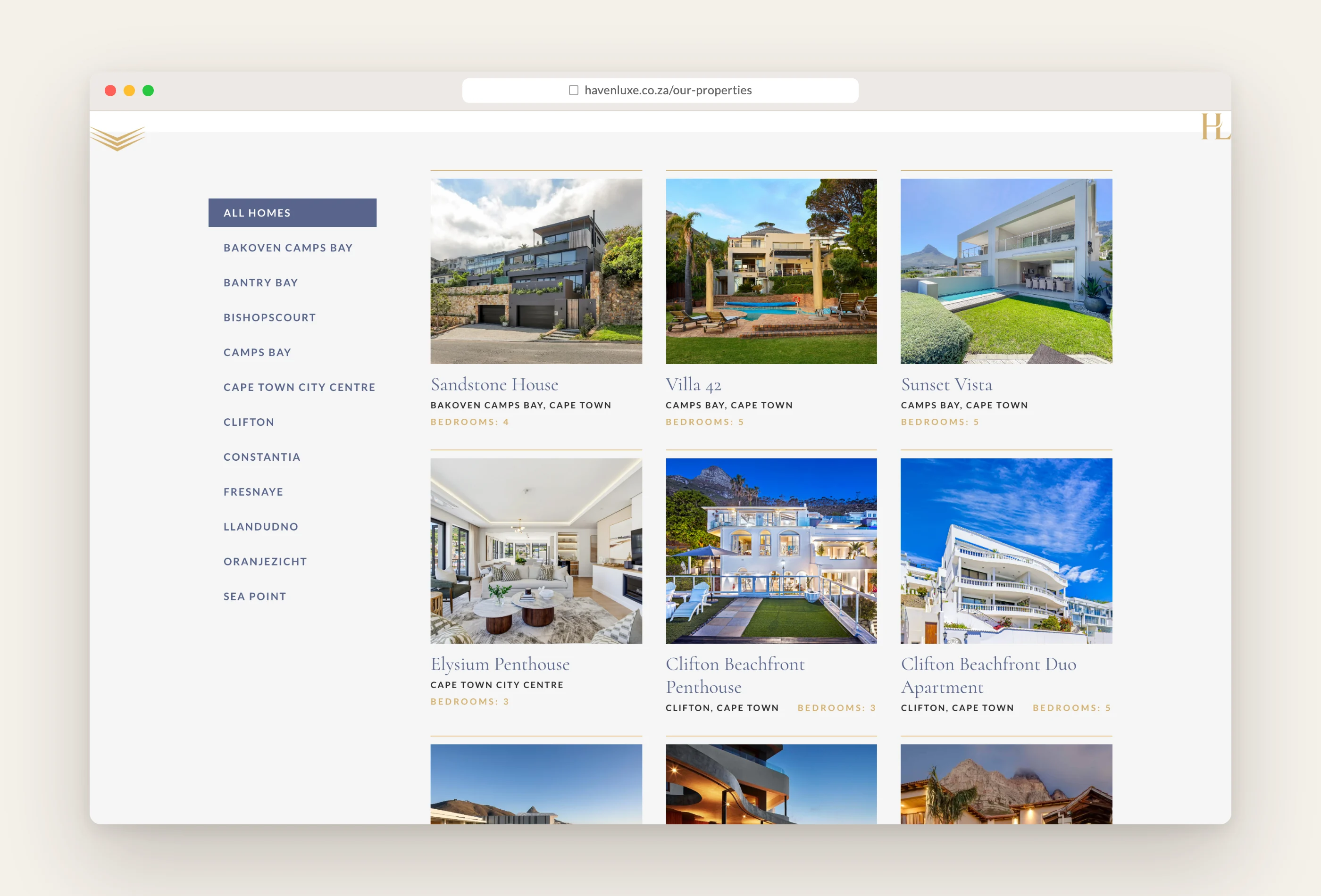
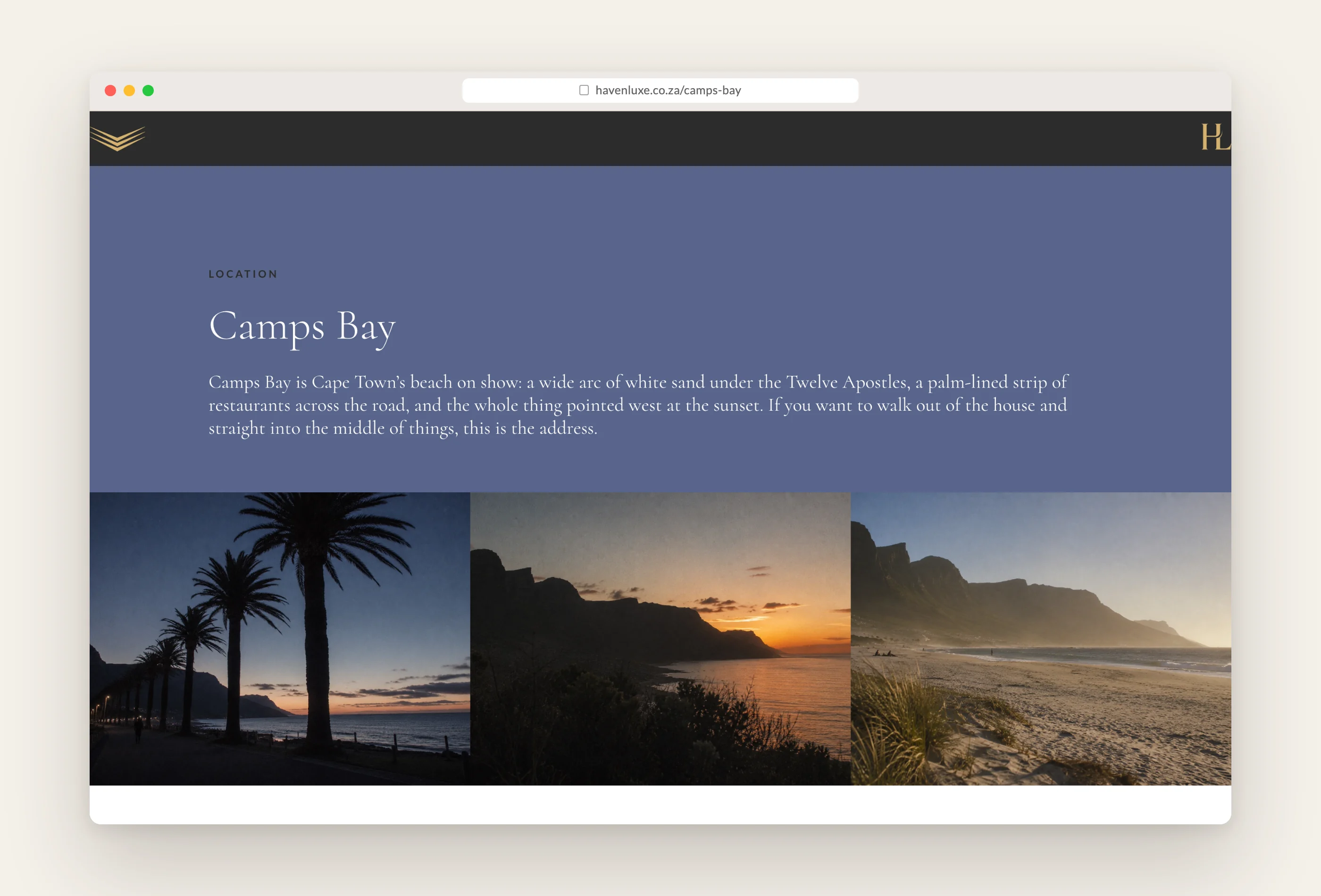
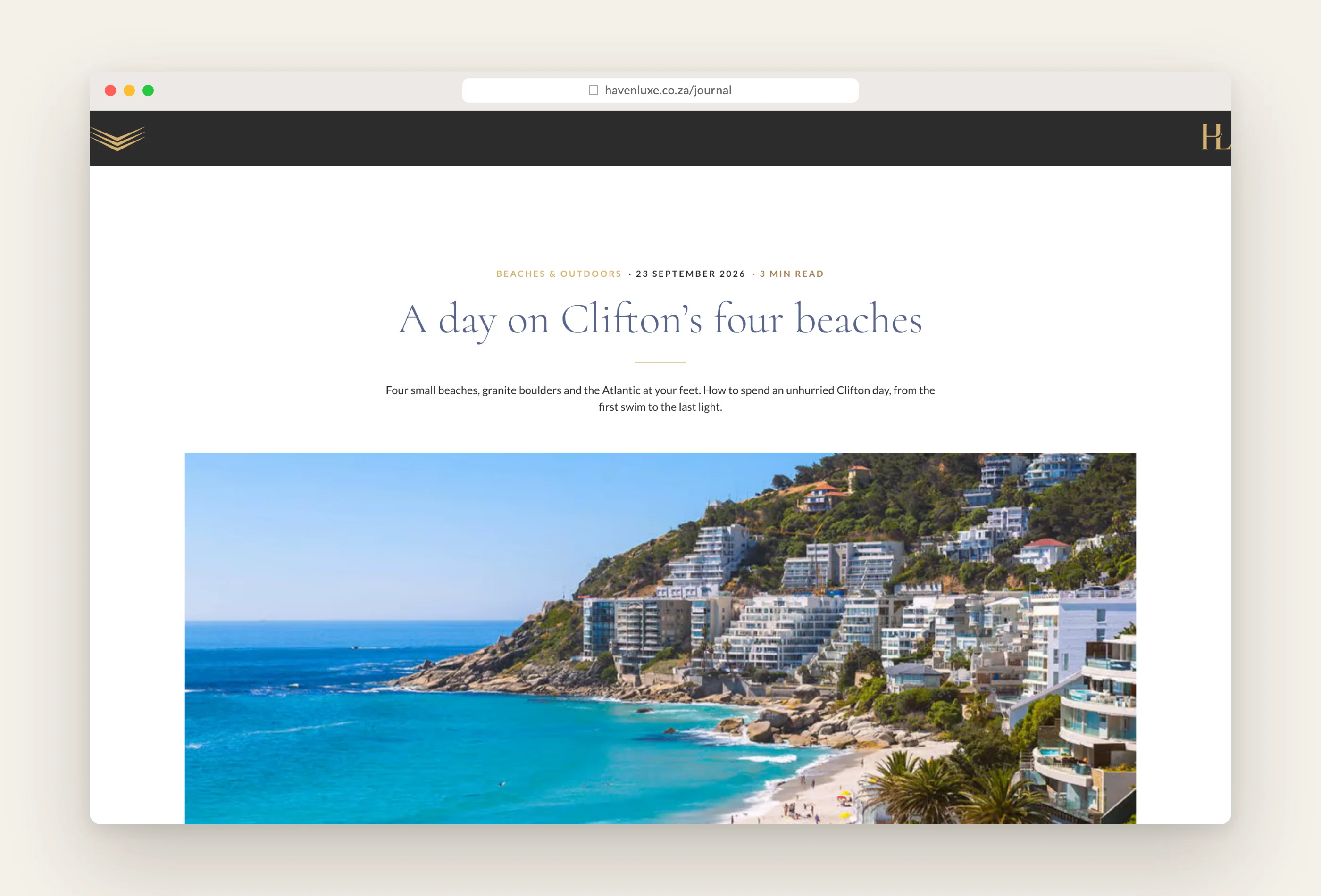
The website sells the feeling before the floor plan. Ocean light, long tables, linen and sunsets lead, and the homes follow. Every property has its own page built from the same set of fields, the Our Properties page filters by neighbourhood, twelve neighbourhood guides run from Clifton to Constantia, and the Travel Hub journal tells the stories that make Cape Town worth the trip. Booking and enquiry forms go straight to the team.
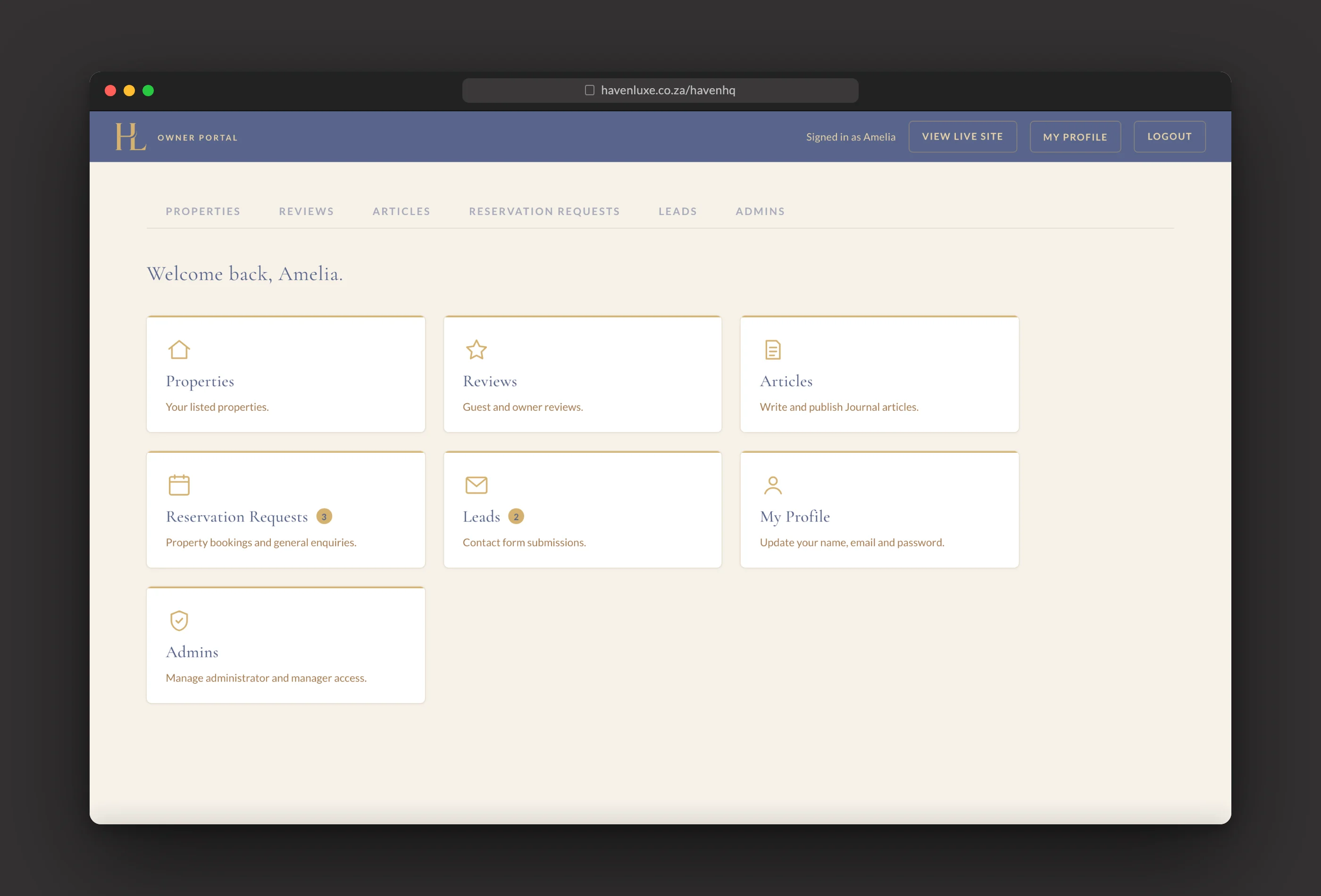
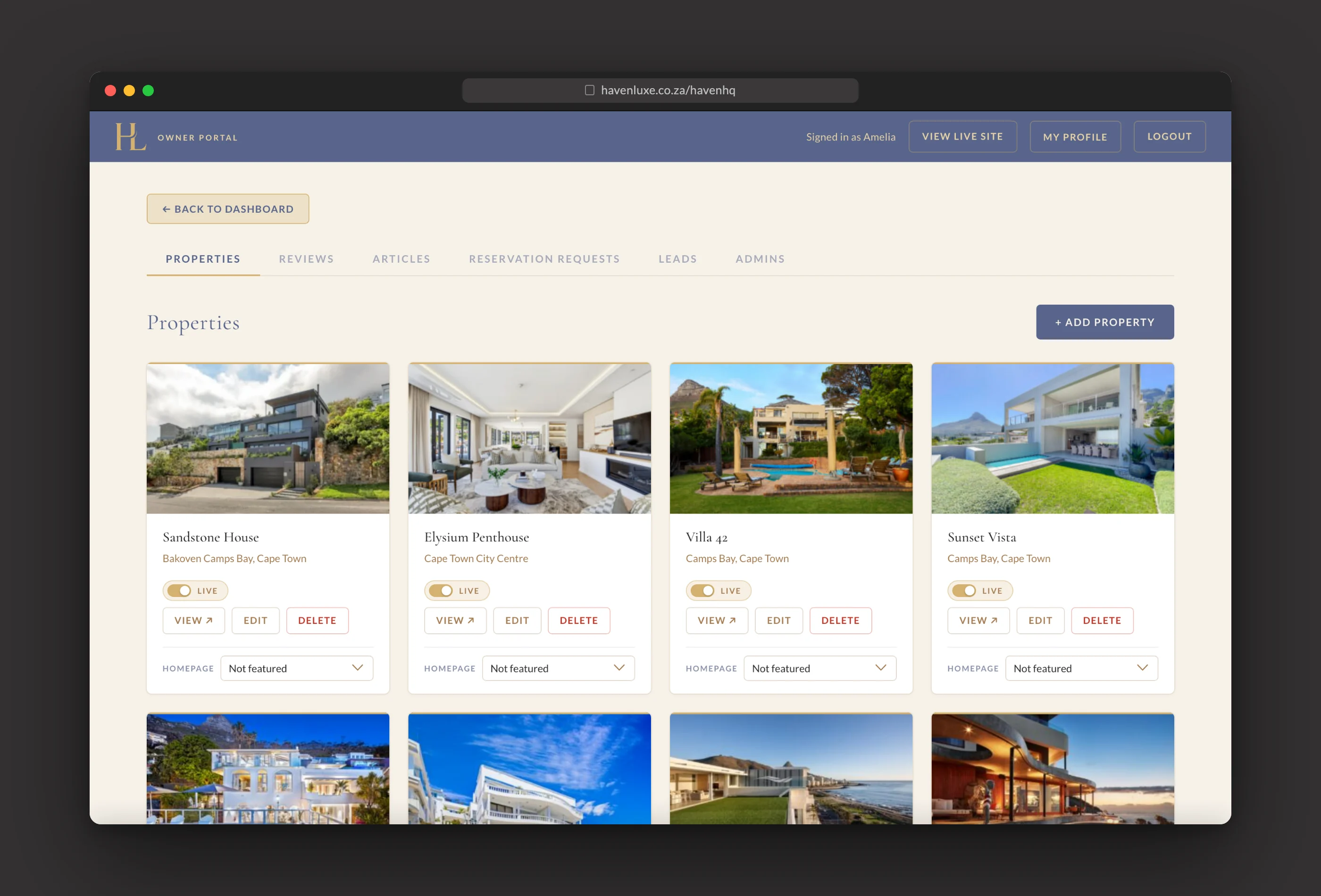
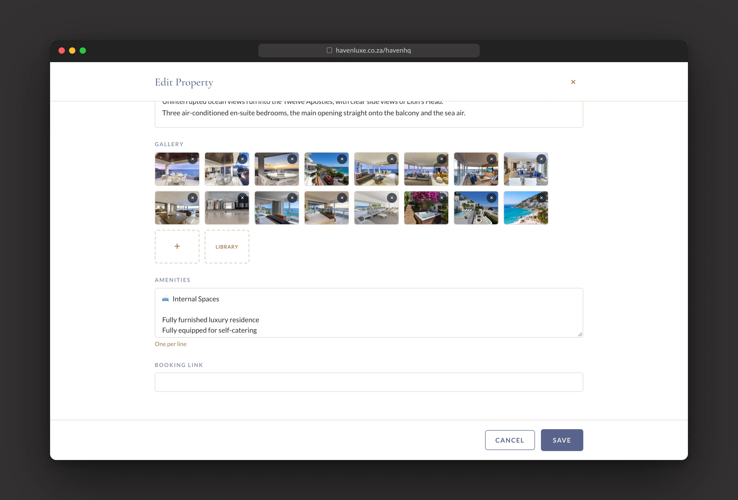
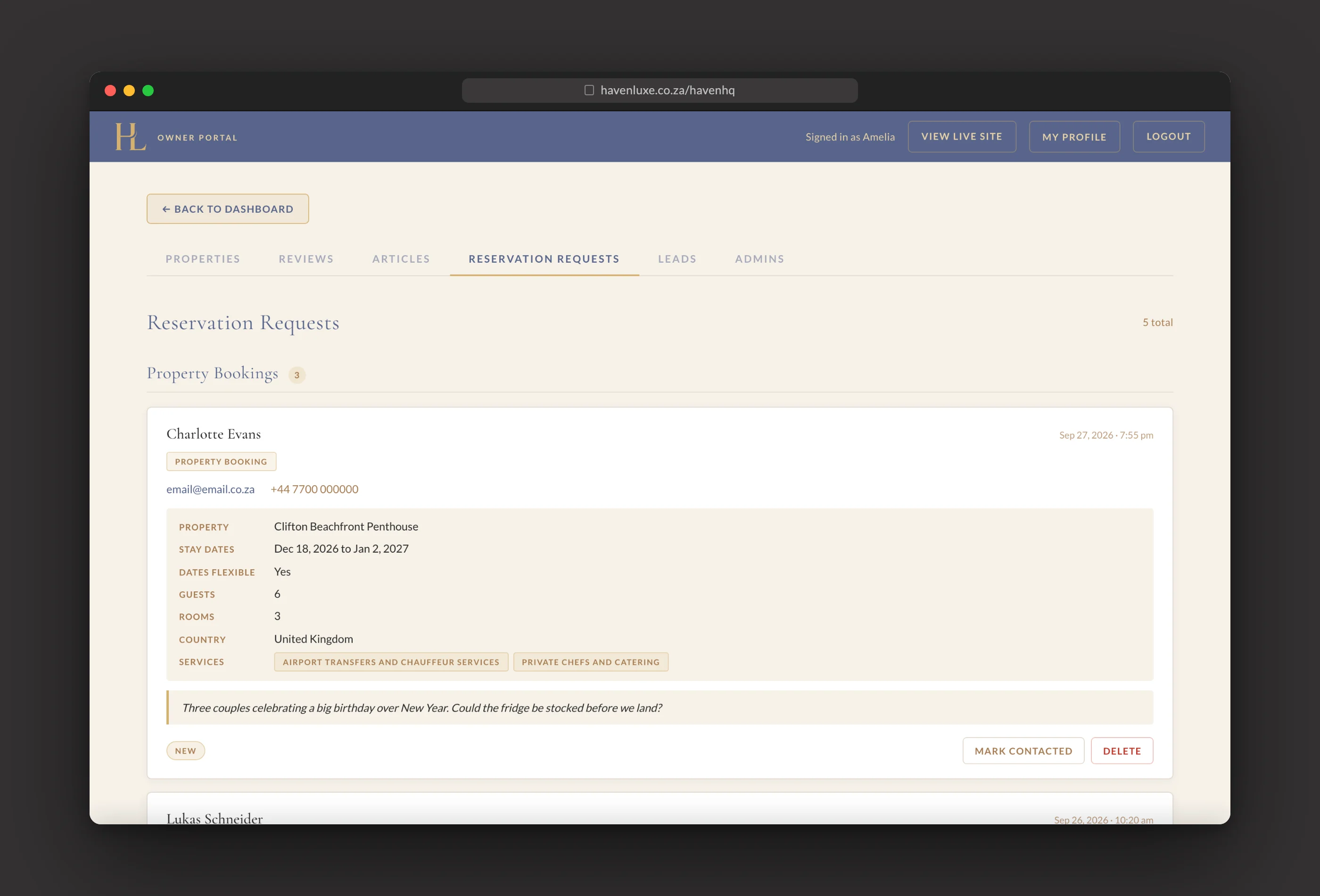
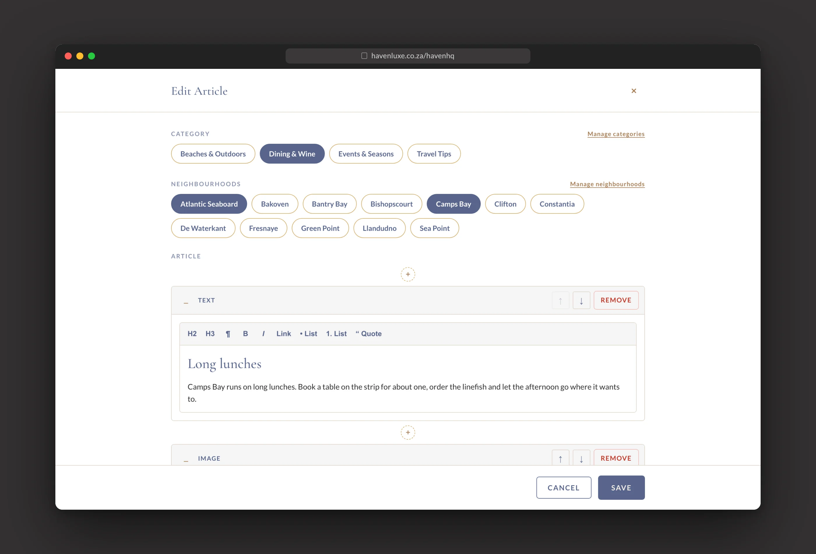
Behind it sits HavenHQ, a private owner portal we designed and built so the Havenluxe team runs the site themselves: homes, photo galleries, reviews, journal articles, booking requests and enquiries, all from one branded sign in, without opening WordPress. Take the walkthrough to see it working.

Wil jy volgende wees?
Vertel ons wat jy maak, die gehoor wat jy wil bereik, of die probleem wat jy wil oorgee.