
This Way Out.
An identity for THIS WAY OUT, a premium outdoor brand, built to capture the spirit of adventure in a bold, structured retail presence. The wordmark locks into a square that reads as a doorframe: the passage between inside and out.

The brief.
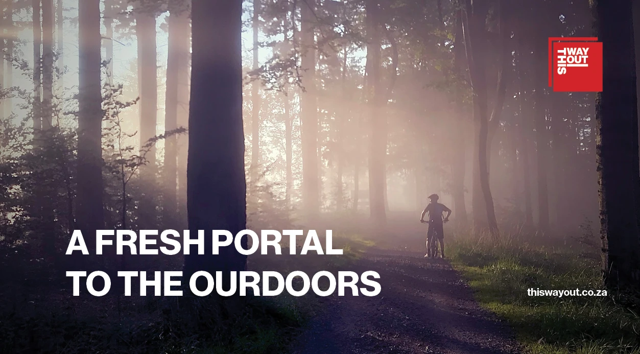
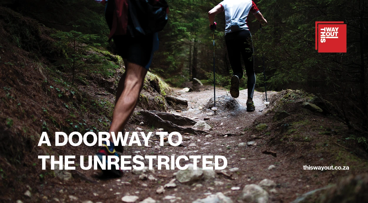
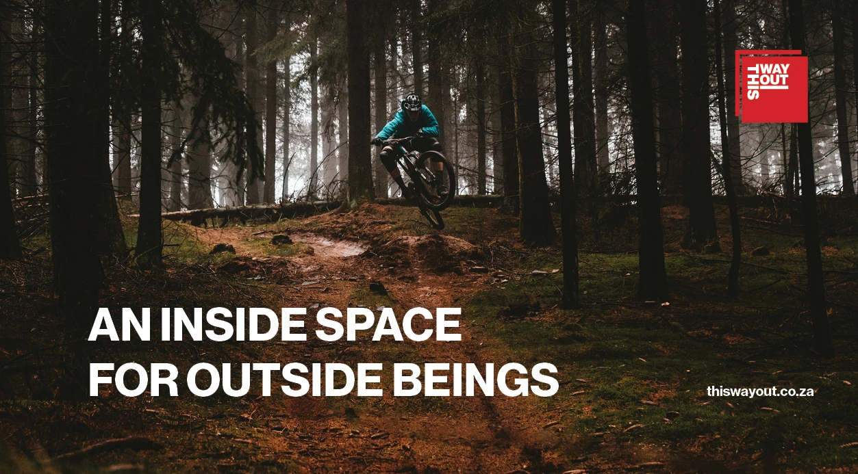
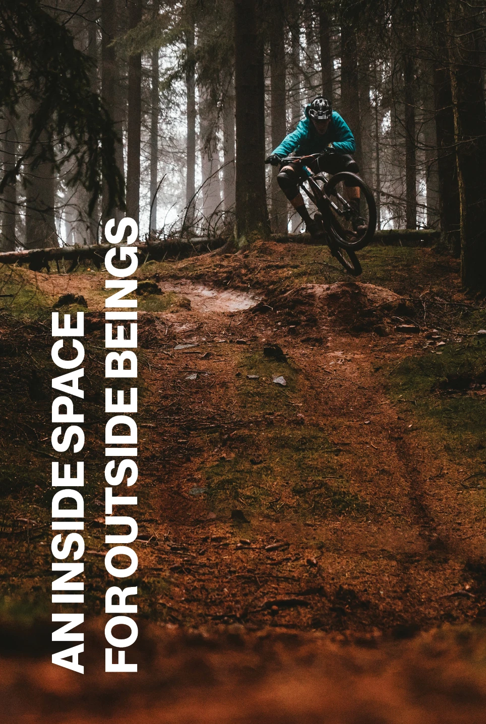
Designed for a premium sporting goods brand, the system strikes a careful balance between urban sharpness and nature-driven freedom. The custom wordmark, stacked into a square lock-up, becomes a visual metaphor for a doorframe, a passage between inside and out, while the high-contrast red signals confidence, clarity and movement. This visual language extends confidently into campaign work, with striking outdoor photography framed by expressive headlines and consistent logo placement. Phrases like and “A doorway to the unrestricted” tie into the brand’s philosophy of equipping customers for both physical exploration and inner freedom.
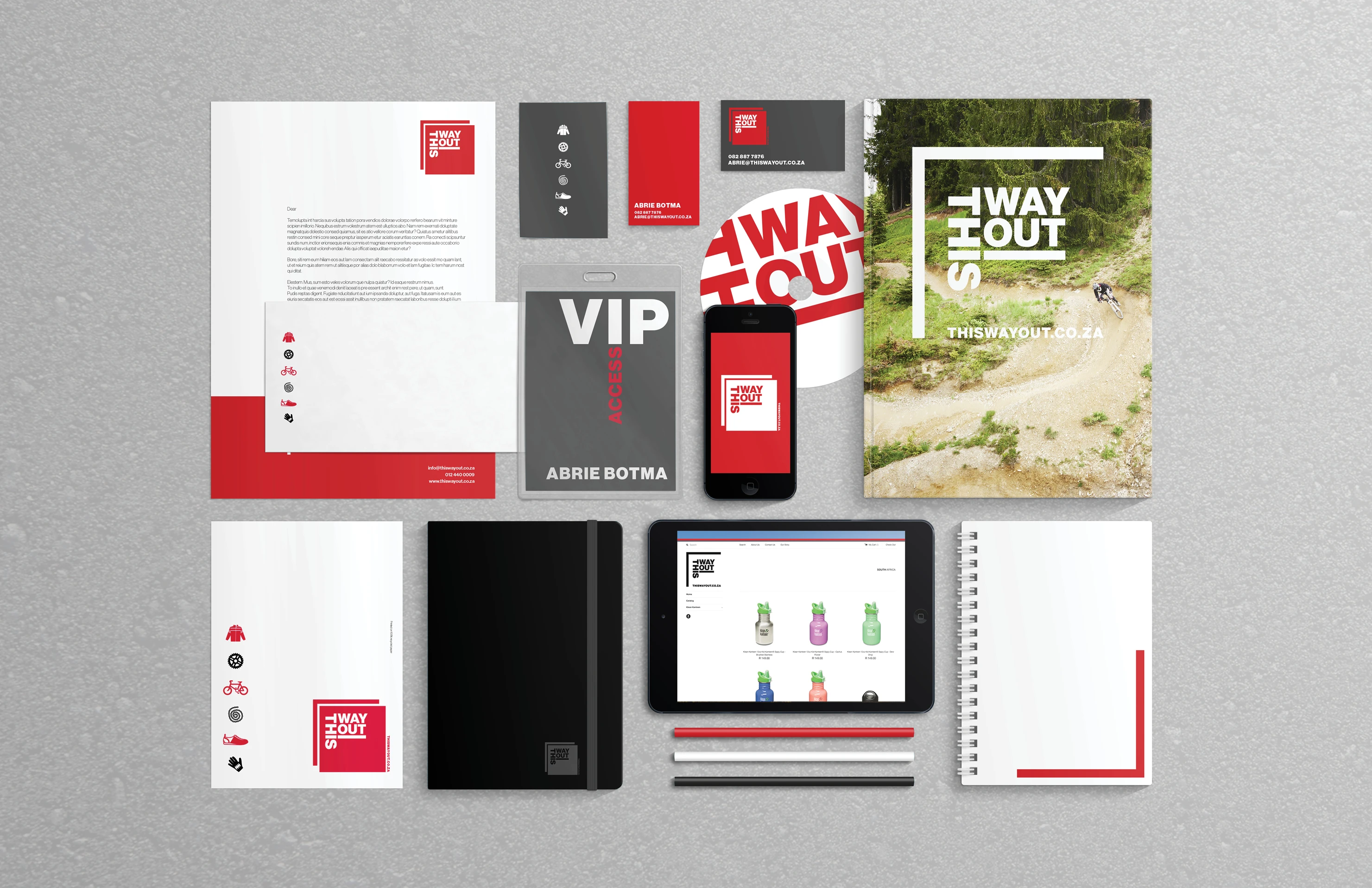
The application across stationery, packaging, signage, apparel and digital reinforces a brand that is both grounded and aspirational. From the in-store experience to digital campaigns and VIP branding, every detail strengthens the idea of movement with direction. THIS WAY OUT does not just sell outdoor gear, it presents an identity that guides, excites and opens the way for people to step beyond the ordinary.
An inside space for outside beings


Want to be next?
Tell us what you are making, the audience you want to reach, or the problem you would like to hand over.