

The brief.
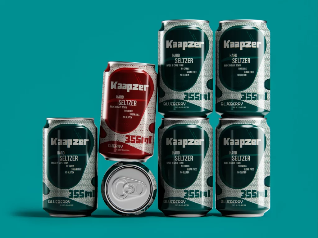
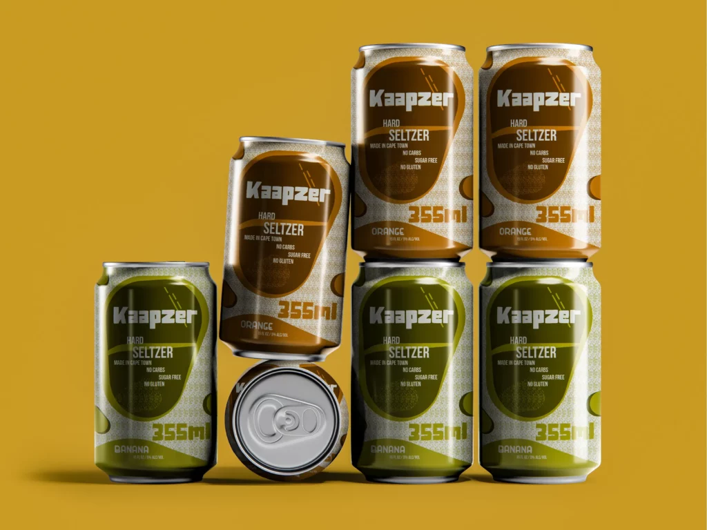
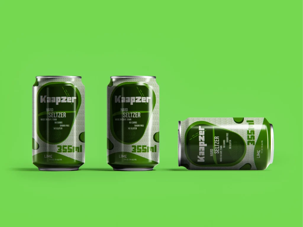
With a brief to keep it fresh but with dark, moody undertones, Sorted Design International developed a packaging system that’s both punchy and distinct, striking a balance between urban grit and crisp refreshment. Each of the five flavours, Blueberry, Cherry, Lime, Banana, and Orange, was given its own colour world, supported by a consistent visual language rooted in graphic forms, stylised droplets, and layered textures. The result is a series that holds together as a family, yet lets each flavour stand on its own shelf.
Typography is assertive but clean, reflecting the no-nonsense character of the drink: no sugar, no gluten, no carbs. The 355ml packs feel modern and slightly unconventional, perfect for a younger market looking for something that doesn’t follow the usual soft pastel trend. The final visual identity translates across cans, multipacks, and digital media, designed to catch attention and spark curiosity in a crowded category.
Fresh, local, and slightly rebellious, Kaapzer looks the way it tastes.
Want to be next?
Tell us what you are making, the audience you want to reach, or the problem you would like to hand over.